CoursesCompose Multiplatform, one screen from state to pixels
Puzzle 3 · 4 of 4
Can VoiceOver understand the bookmark?
A custom bookmark icon looks right. Make its action understandable without seeing the screen.
All puzzles in this course
The problem
A custom icon toggles a bookmark and changes from outline to solid. A sighted person can see the difference. What information can a person using VoiceOver get?
See it
Scroll sideways to see the full diagram.
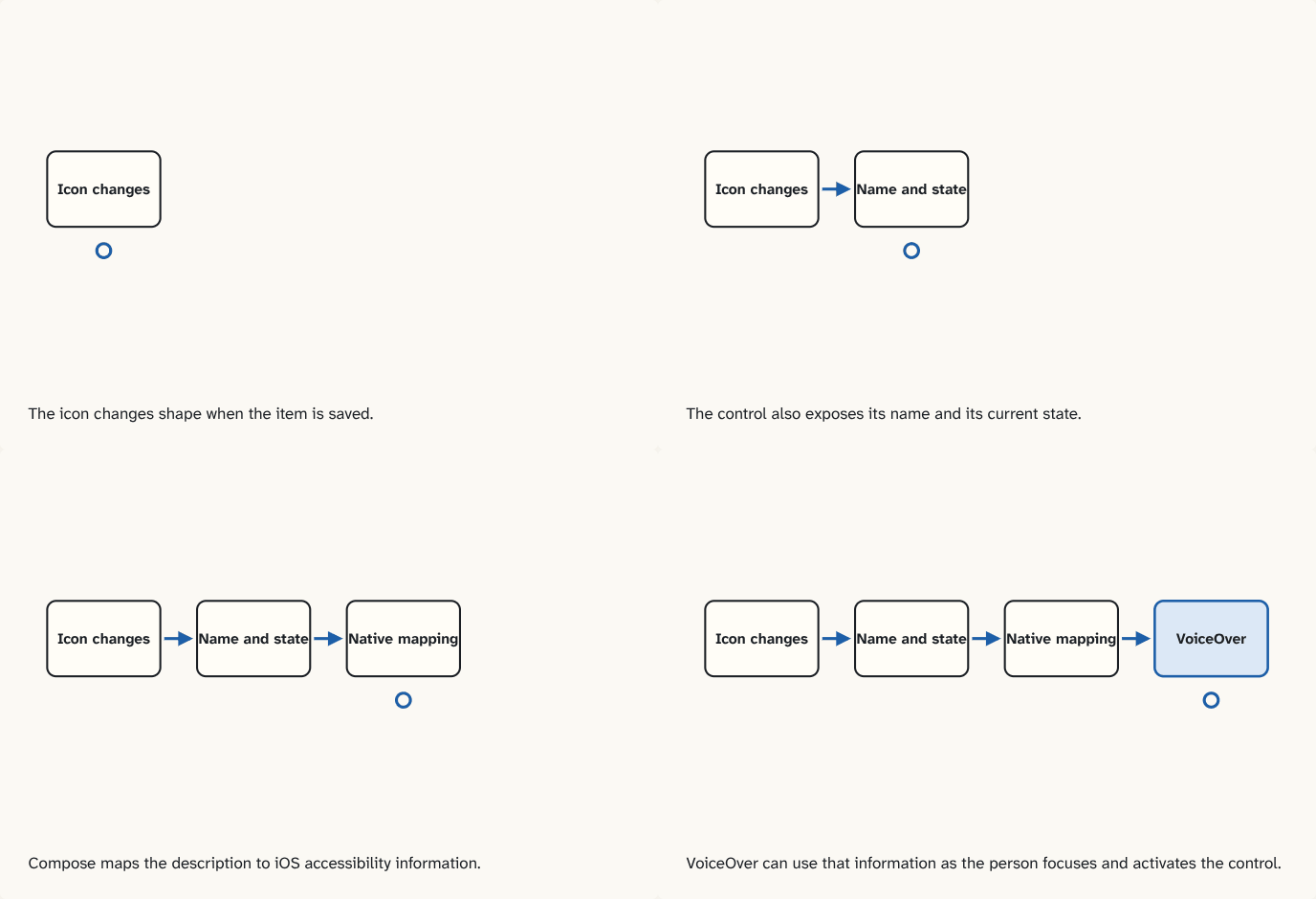
The icon changes shape when the item is saved.
Step 1 of 4The control also exposes its name and its current state.
Step 2 of 4Compose maps the description to iOS accessibility information.
Step 3 of 4VoiceOver can use that information as the person focuses and activates the control.
Step 4 of 4
The building block
Accessibility semantics are UI descriptions that a device's assistive technology can use, such as a label, a role, a current state or an action. On iOS, the screen reader is VoiceOver. Compose Multiplatform maps its semantics data to native accessibility services.
For this bookmark, expose what the control does and whether the item is currently saved. Prefer a control that already represents a toggle, then give it a meaningful label and expose the checked state. Keep the icon decorative if the surrounding control already provides the complete description.
| Situation | What the user should be able to learn |
|---|---|
| Focus before saving | Which item the action applies to and whether it is saved |
| Activate the control | That bookmarking can be toggled |
| Focus after saving | That the item is now saved |
A visual check proves part of the behavior. On an iPhone, verify focus order, spoken meaning and whether activating the item changes the state. Test a native field embedded in the same screen independently as well. At the hosting boundary, its view and interaction differ from the surrounding shared UI.
Go deeperDesign a two-platform check
What would a useful check record if the same icon works on iOS and Android?
Record the focused control, distinguish its saved and unsaved states, activate it with the platform screen reader, and verify the result. Keep platform-specific wording separate from the intended meaning.
Check yourself
What you now know
Compose semantics describe meaning and actions independently from pixels. On iOS the mapping to native accessibility information makes those semantics available to VoiceOver.
Answer every question above correctly to unlock the next puzzle.
That's everything published so far
You've reached the last puzzle of Compose Multiplatform, one screen from state to pixels.
New puzzles are announced on LinkedIn and in the learning log feed.
Something wrong or unclear on this page? Tell me: a puzzle that didn't click is a bug in the puzzle.